The #1 Paint Mistake When Selling!
Introduction
Why paint color choice can impact a listing
The colors you choose for interior spaces can influence buyer perception in subtle, powerful ways. A fresh paint job signals care, modernity, and upkeep, while the wrong palette can highlight flaws or feel dated in photos.
A neutral, well-executed color story helps buyers imagine themselves living there and can affect offers and time on market. Focus on supporting the property rather than personal taste, as highlighted by industry professionals.
How this article will guide sellers to maximize offers
We’ll unpack common paint missteps and share practical, lender-approved approaches that balance style with broad appeal.
Expect actionable guidance you can apply quickly, without overhauling your entire home. We’ll cover room-by-room strategies, color selection mindsets, and when a simple refresh is enough to boost value.
- Identify the #1 paint mistake and how to avoid it.
- Distinguish between safe neutrals and rooms that deserve a touch of color.
- Learn how color placement can influence perceived condition and price.
2. Over-Personalization: Bright, Saturated, and Niche Tones
Why bold personal favorites may deter buyers
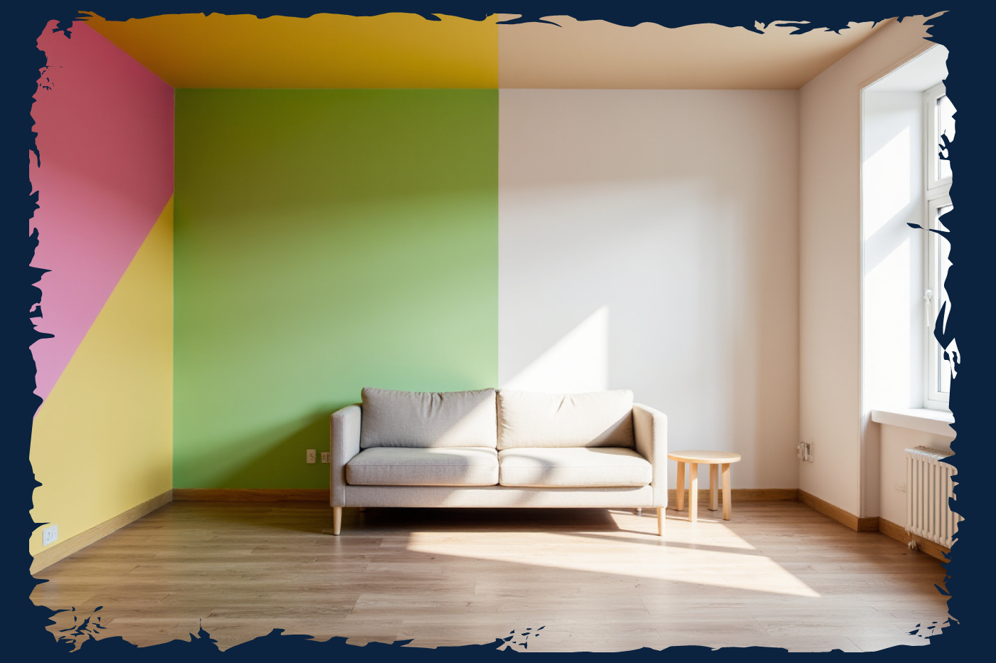
Bold, individualized colors can feel like a personal statement rather than a neutral backdrop. When walls shout a specific taste, buyers struggle to picture their own furniture and decor in the space. This is especially true for rooms that buyers expect to be calm and versatile, such as living rooms and bedrooms.
Photos can exaggerate intensity, making spaces appear smaller or harsher. A color that reads bold in person may read even stronger in listing photos, reducing overall appeal and narrowing the pool of interested buyers.
Strategies to neutralize without sacrificing style
- Swap highly saturated tones for softer versions in the same family to preserve mood without shouting color.
- Reserve standout shades for accent features like an art wall or a single focal piece rather than entire rooms.
- Test color in small patches first to gauge how it reads in different lighting and throughout the day.
- Balance bold choices with natural textures and light, ensuring photos stay inviting rather than overpowering.
3. The Neutrals Dilemma: When Safe Isn’t Smart
Choosing modern neutrals that don’t feel clinical
Neutral tones win broad appeal, but they can read sterile if misapplied. Look for warm undertones in whites and grays to avoid a clinical vibe that makes spaces feel lifeless. Subtle warmth helps rooms read welcoming in photos and in person.
Avoid stark, flat neutrals that flatten architectural details. Instead, opt for shades with depth that still read clean and modern. This balance keeps rooms feeling polished without disappearing into the background.
Balancing warmth and sophistication in common areas
Common areas benefit from a cohesive palette that ties rooms together while allowing focal features to stand out. Introduce a unifying undertone across spaces, then layer with textures and materials to add richness.
In high-traffic zones, choose neutrals that resist showing wear and maintain a bright, open feel. Pair with natural wood, fabric textures, and light accents to elevate sophistication without narrowing buyer interest.
4. The Maths Behind Color: How Color Affects Value
Evidence of color impact on perceived condition and price
Color choices shape how buyers read a home’s upkeep and potential. A thoughtful palette can make surfaces feel newer, while off hues may draw attention to imperfections. Color influences buyer confidence in condition, which can influence offers.
Calm, neutral environments tend to read as ready-to-move-in, reducing perceived remodeling risk for buyers. A cohesive palette supports flow from room to room and reinforces a well cared-for feel.
Where buyers tend to assign value in color-driven rooms
- Entryways and kitchens: color sets the first impression and signals updates.
- Living areas: a unified palette helps buyers visualize daily living and layouts.
- Bedrooms: softer, balanced tones convey restfulness without personalization.
- Bathrooms: light, fresh neutrals can enhance perceived cleanliness and upkeep.
| Room/Area | Color Approach | Buyer Perception | Notes |
|---|---|---|---|
| Entryway | Warm neutrals or soft white | Up-to-date and inviting | Sets tone for the rest of the home |
| Living room | Cohesive palette across adjacent spaces | Feels spacious and organized | Highlights layout and focal features |
| Bedroom | Calm, balanced tones | Restful ambiance without personalization | Supports staging with light textures |
5. Color Placement: Which Rooms Benefit from Color and Which Don’t
Best practices for entryways, kitchens, living rooms, and bedrooms
Use color strategically where it creates the strongest first impression. Entryways benefit from a welcoming accent wall or warm trim that signals a modern, cared-for home. Kitchens respond to color in cabinets, backsplashes, or a subtle wall hue that reduces clutter and highlights space. Living rooms gain cohesion from a unifying palette that allows furniture layouts to feel natural. Bedrooms should stay calm, with soft tones that promote rest without feeling clinical.
- Entryways: consider a warm neutral with a soft accent to set the tone.
- Kitchen: limit bold walls; a colored island or backsplash can add personality without overwhelming.
- Living room: keep a cohesive color story across adjoining spaces to enhance flow.
- Bedroom: prioritize serene, balanced tones for a restful backdrop.
Where to reserve color for impact (and avoid overkill)
Reserve color for features that readers notice first, not the entire room. Use color on a focal area like a single wall, an architectural detail, or a storage feature. Avoid saturating walls in multiple spaces or pairing conflicting hues in high-traffic zones to prevent buyer fatigue.
| Room | Color Approach | Impact | Notes |
|---|---|---|---|
| Entryway | Warm neutral with a bold front door or accent wall | Strong first impression | Sets expectation for rest of the home |
| Kitchen | Neutral walls with colored island or backsplash | Contemporary feel without distraction | Pushes focus to cabinetry features |
| Living room | Unified palette; limited pops of color | Spacious and cohesive | Supports furniture layout |
| Bedroom | Soft, balanced neutrals | Restful and versatile | Accommodates various decor styles |
6. Quick-Refresh versus Full Remodel: Cost-Effectiveness of Paint
When a fresh coat is enough
A light refresh can deliver a noticeable upgrade with minimal disruption. If walls show scuffs, dullness, or uneven tones but the structure is sound, a single coat of high-quality paint can restore brightness and cohesion without the cost of a full remodel.
Consider time and budget. A quick refresh often costs far less than major renovations, helping you preserve equity while presenting a move-in ready home to buyers.
Signs it’s time to level up beyond paint
Noticeable structural issues, outdated layouts, or persistent color clashes that buyers see repeatedly in photos warrant deeper updates. If color or finish reads as dated and consistently pulls attention away from features, a more comprehensive refresh may be prudent.
| Scenario | Paint Impact | Recommended action |
|---|---|---|
| Minor scuffs, faded walls | High improvement, low cost | Quick refresh with a cohesive neutral |
| Color clashes across rooms | Partial fix, may not unify spaces | Targeted tweaks or a cohesive neutral overhaul |
| Outdated layout or fixtures | Limited impact | Non-paint updates or larger remodels |
FAQ
What color should I choose for a quick sale?
Pick a fresh, neutral palette that reads as welcoming on photos. Light grays, warm beiges, and off-whites tend to appeal to a broad audience. Avoid stark whites in rooms with abundant natural light that can read sterile.
How many colors should I use in a home?
Aim for cohesion with up to three color families. Use one dominant neutral, one supporting neutral, and a single accent color for focal areas. This keeps spaces harmonious without feeling busy.
Should I hire a color consultant?
Consider a color consultant if you’re unsure how to balance tones across spaces or if you’re targeting a specific market. A professional can map color connections between rooms and align choices with current trends.
| Scenario | Recommended Approach | Notes |
|---|---|---|
| Fresh, fast sale | Neutral base with light accents | Prioritize brightness and flow |
| Muted, cohesive look | Two neutral tones plus one accent | Maintains depth without distraction |
| Market targeting families | Warm, inviting neutrals; durable finishes | Photos read well in varied lighting |
Conclusion
Recap of the #1 paint mistake and how to avoid it
The core misstep is choosing a color that clashes with a space or reads differently in photos than in person. Aim for a neutral backdrop with subtle, well-placed accents to keep photos cohesive and inviting.
Focus on space function and lighting rather than personal preferences. A balanced palette helps buyers imagine themselves in the home and maintains equity through the selling process.
Next steps for Shelley Sims clients: equity insights and valuation guidance
We provide guidance on how color choices may translate into value shifts within your market window. Our approach links color decisions to overall readiness and sale expectations.
Use professional valuation support to validate color plans against your timeline and budget. We help determine whether a refresh yields meaningful impact or if resources are better directed elsewhere in the plan.
References
- The 1 Paint Color Mistake Real Estate Agents Say Sellers Always Regret
- The Biggest Paint Mistake When Selling a House (White Paint)
- Torn between painting or not painting before selling a house. Would love ...
- Selling Your Home? The Wrong Paint Colors Could Affect Your Offers
- Colors to Avoid When Selling a Home